Welcome back to Stats Corner.
I won’t try and pretend that the inspiration of this weekly Message Board Post isn’t the “Skeptical Football” column found weekly on fivethirtyeight.com. Despite its flaws it provides interesting insights into the NFL. In the inaugural column this year the author Benjamin Morris (twitter handle @skepticalsports, I reccommend you follow) created a heat map/matrix of records and historicalplayoff probabilities. Link. This week I bring that to you for Bad Newzs.
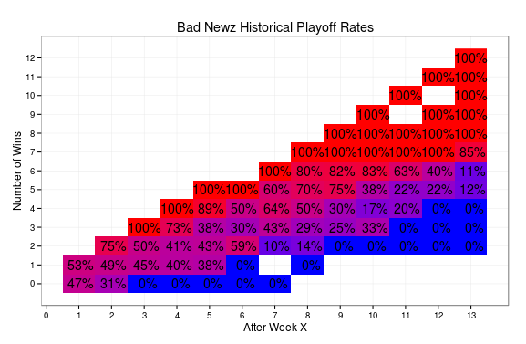
Morris called them probabilities but I think a more accurate term is historical rates. A very astute twitter follower of Morris’s pointed out that these probabilities reveal team strengths, don’t determine them. There is nothing predictive about them. Though after taking a glance at the graphic D’Skae has to be feeling very good about his chances while Himmy, well, not so much.
These values reflect empirical x/n ratios. Just because it shows that 100% of previous teams at 4-0 made the playoffs that doesn’t mean it’s a guarantee. Again, nothing predictive about these values. Also, sample size is an imporant factor. Surprisingly very few teams have ever been undefeated or totally winless after 4 weeks. As the weeks go on there is more variation in the number of wins and therefore less sample in each bucket to draw from. A similar graphic representing the sample size for each square can be found here.
White spots indicate that there is no data to determine historical rates of making the playoffs. This is either due to no team ever having that amount of wins after X weeks or the logistical impossbility of having say, 8 wins through week 5. A similar sample size heat map can be found here for those interested.
One final technical note. In 2009 there were 10 teams and 6 playoff spots. So heading into the season everyone had a 60% chance of making the playoffs (all other things being equal, which obviously they aren’t, but indulge me). Ever since the expansion to 12 teams in 2010 every team has a 50% chance of making the playoffs. (Again all things being equal or the latin term XXX). We of course know that all other things are not equal. Some teams for example draft two separate running backs whose careers, nevermind season may be over due to off the field behavior. Other teams spend $103 on a quarterback that while rock-solid and as money-in-the-bank as the come for points every weeks hasn’t put up the big time numbers to justify that expenditure.
Anyway, to account for this I adjusted the historical playoff rates from that season so that 60% was now 50%. I wanted to preserve probabilities of 0% and 100% so I used an exponentional adjustment of roughly 1.36. (log(0.5)/log(0.6) is approximately 1.36). so adjusted_p = original_p ^ (1.36). This preserves 0%, 100%, and makes 60% 50%. I call this a mathematical win-win-win.
Also, I’m pleased to announce that the code used to create this graphic as well as calculate all the statistics is up on github. This is all done in R. For those not familiar, github is a repository for software code and projects that allows for colloboration and corroboration. If you all have any fun with the data be sure to upload (or in the terminology of github, ‘commit’) it to the Bad Newz repository.
Lastly, I am launching an analytics focused blog. It’s called My Data Sandbox and you can find it here. Follow the blog on twitter too! @mydatasandbox.
Ciao.